A work for The Fish ><////°>
A work for The Fish ><////°>
Fuell is a startup born at the end of 2019 in Spain and with international vocation since it has important investors in the United States.
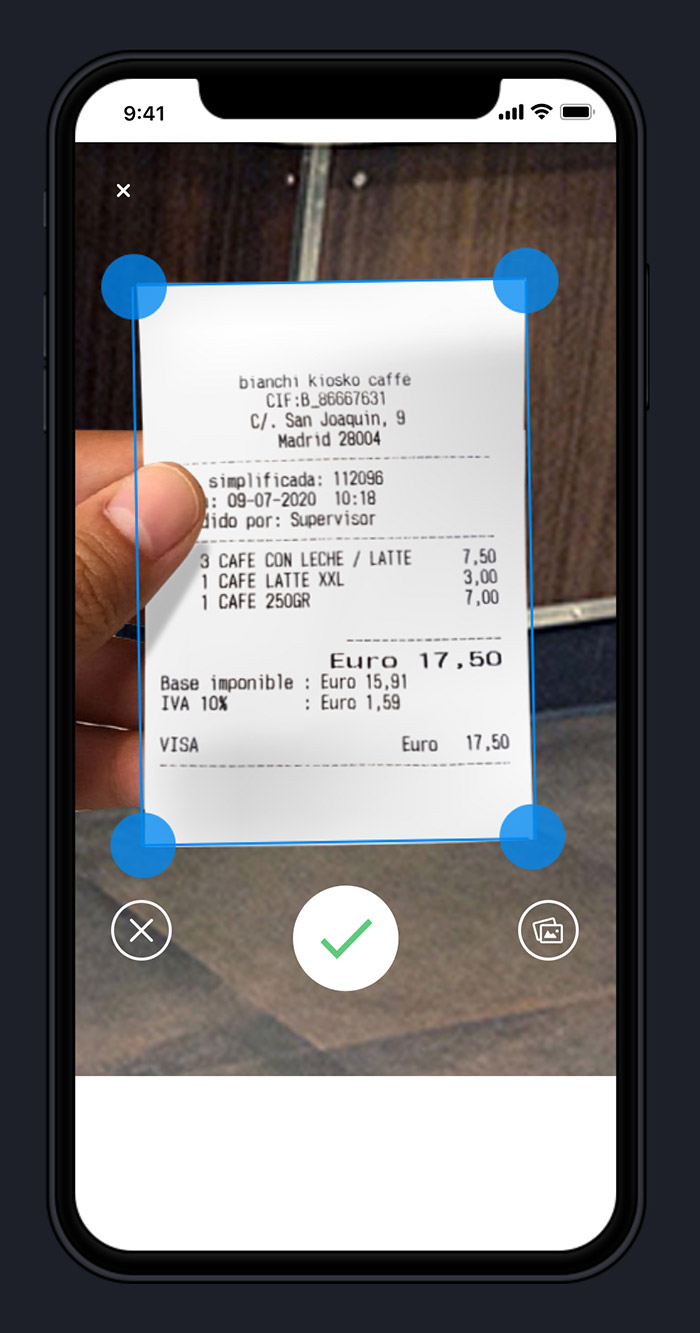
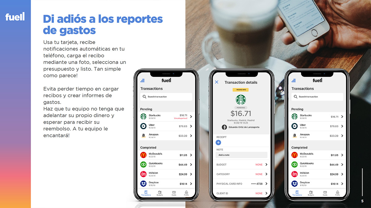
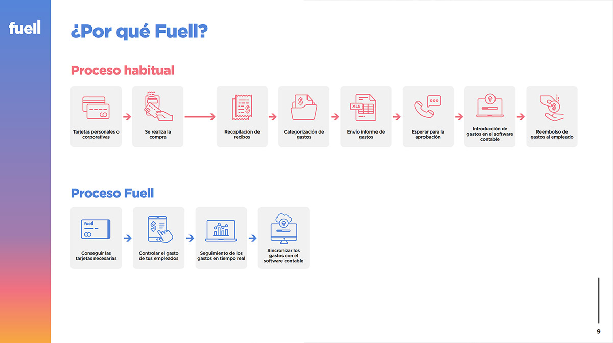
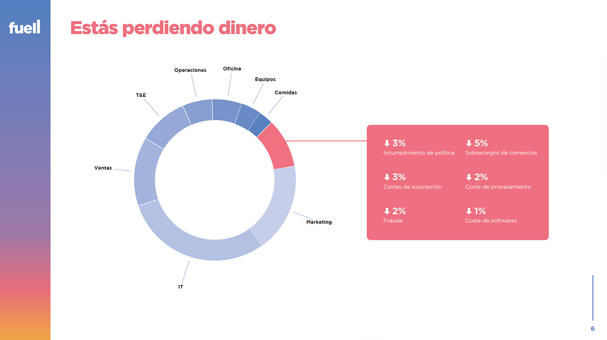
Its financial product is innovative as it not only manages to eliminate the tedious task of creating expense reports for employees by automating the process but also does so with a tool with which employees can benefit from significant discounts in their daily lives (transportation, meals, daycare, health insurance, etc.) and employers can recover VAT on their expenses in an automated manner.
As a startup, the tasks to be performed in the first months of the launch were countless and I assumed the role of Head of Design as a piece in which to capture each new idea, change or need; helping to create the name, colors, or logo; designing the mobile app, the Web App or the websites and landing pages; designing the physical credit card; creating Google ad campaigns; designing presentations for investors and customers, etc.
Despite the difficulties that we have all suffered during 2020 due to the COVID 19 pandemic, we managed to carry out everything that the founders planned, and today the project is growing at a very good pace, attracting some of the most interesting companies that see in Fuell a new tool that helps the whole team and that integrates very positively into the culture of a company and benefits the employees.
To arrive at the name Fuell, the two founders and I held many brainstorms and meetings; we surveyed many people and did many tests to discard all the alternatives until we found this name. Fuell is a short word, which sounds good and evokes the boost that the financial product offers to its clients.
For the logo, I looked for simplicity, soft colors, and a bold typography in lower case letters, characteristics that are a trend in recent years. I worked on the word so that the double L would draw an ascending chart. Although it is less evident the E hole and the bottom of the U connect, drawing an imaginary line, with that ascending angle of the chart, so subliminally the ascending effect starts at the bottom of the U, covering most of the logotype.
The color palette is very fresh and positive and is based on the imagination of the founders and their summers at the independent music festival in Benicàssim, on the Costa de Azahar in Spain, which they attend every year.
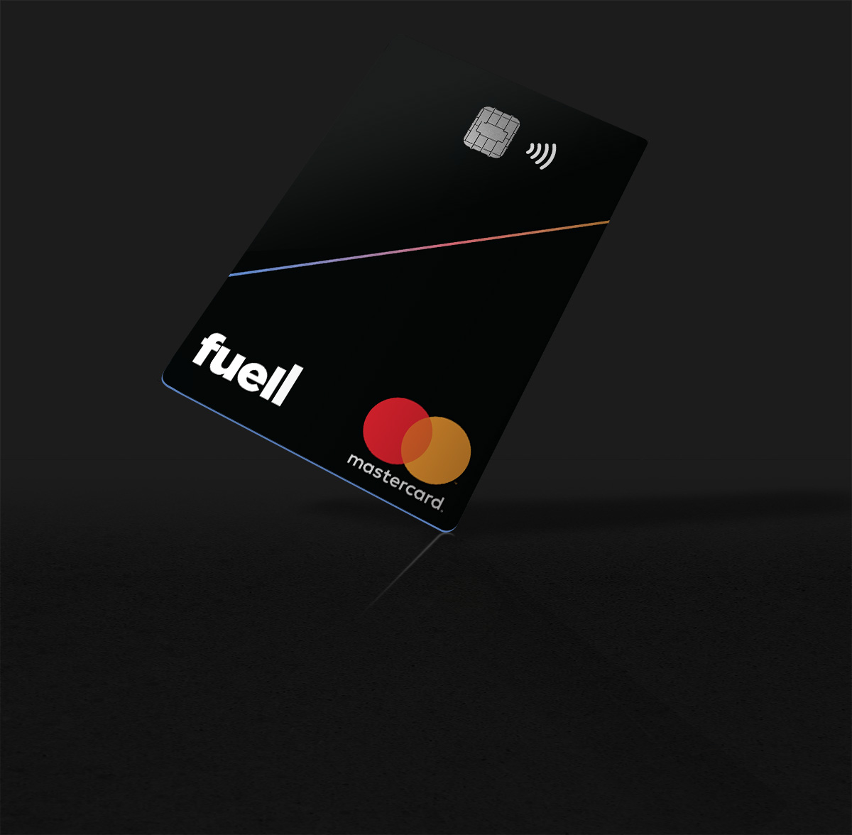
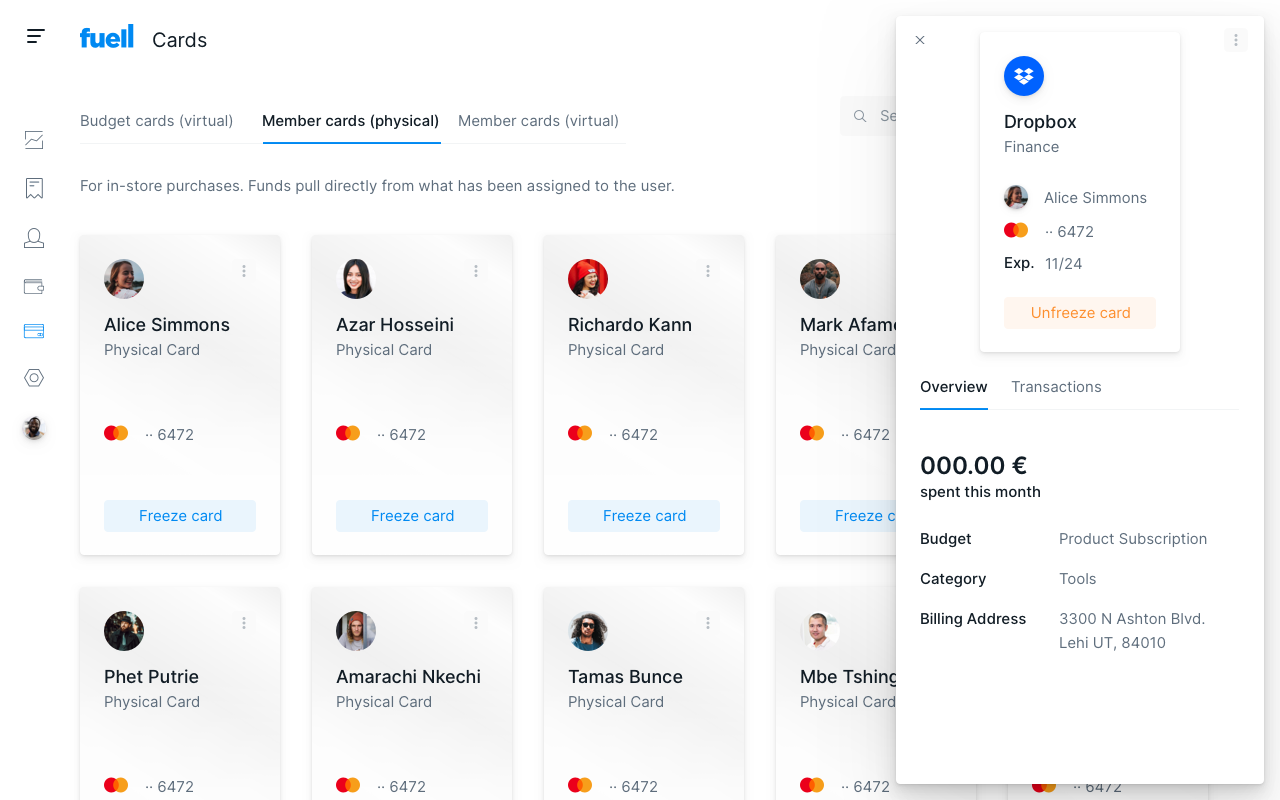
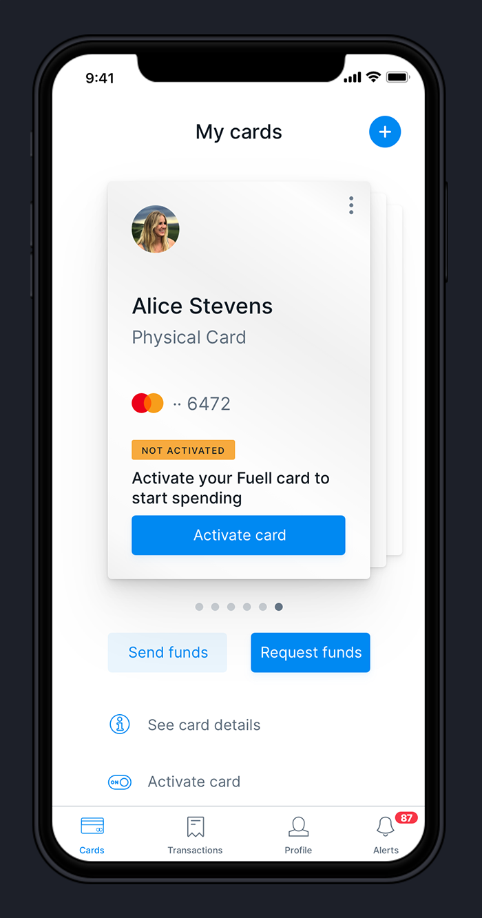
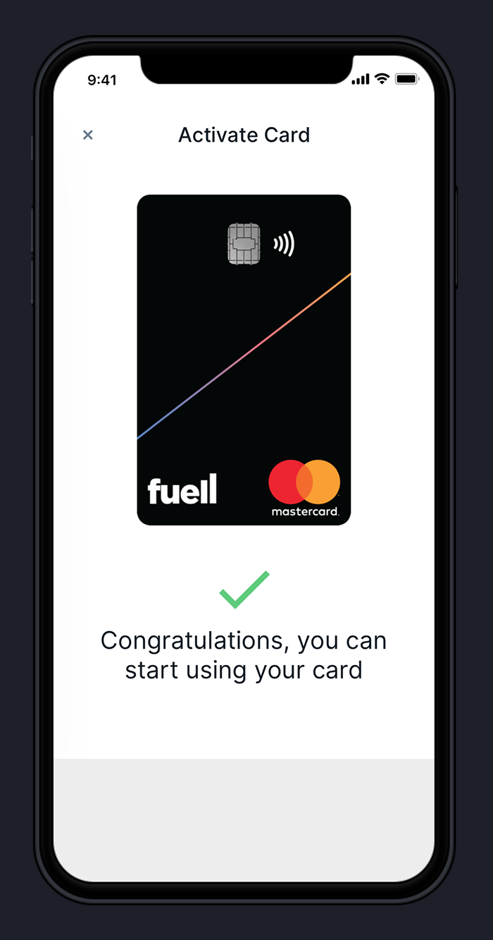
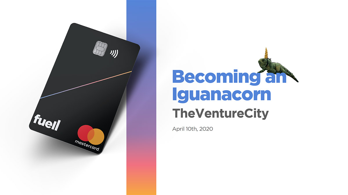
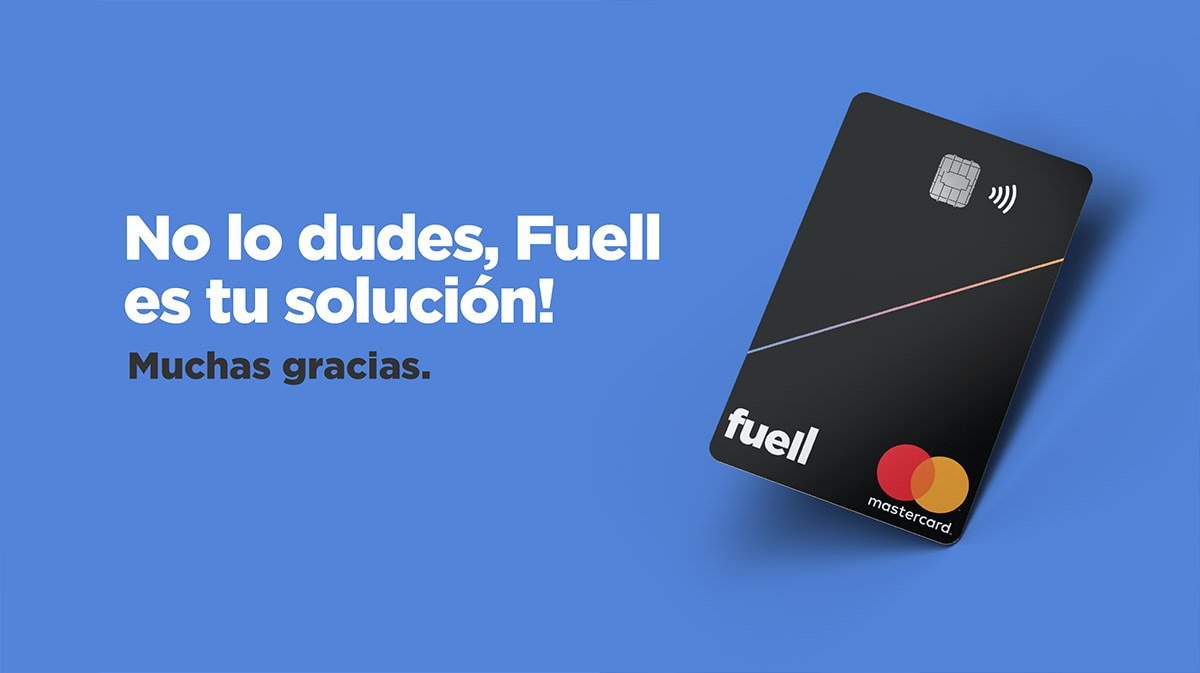
Fuell is many things but it is also a payment method, so it was necessary to have a physical credit card with which employees could make their business expenses quickly but also presume that their company treats them well because they use Fuell.
The design of the card is simple but with a premium look. Metallic, vertically oriented, with a piano black background, which is crossed by a thin line filled with a gradient of the brand’s colors. The edge of the card is Fuell blue so that it stands out from the other cards when you open the wallet even though they are all stacked.
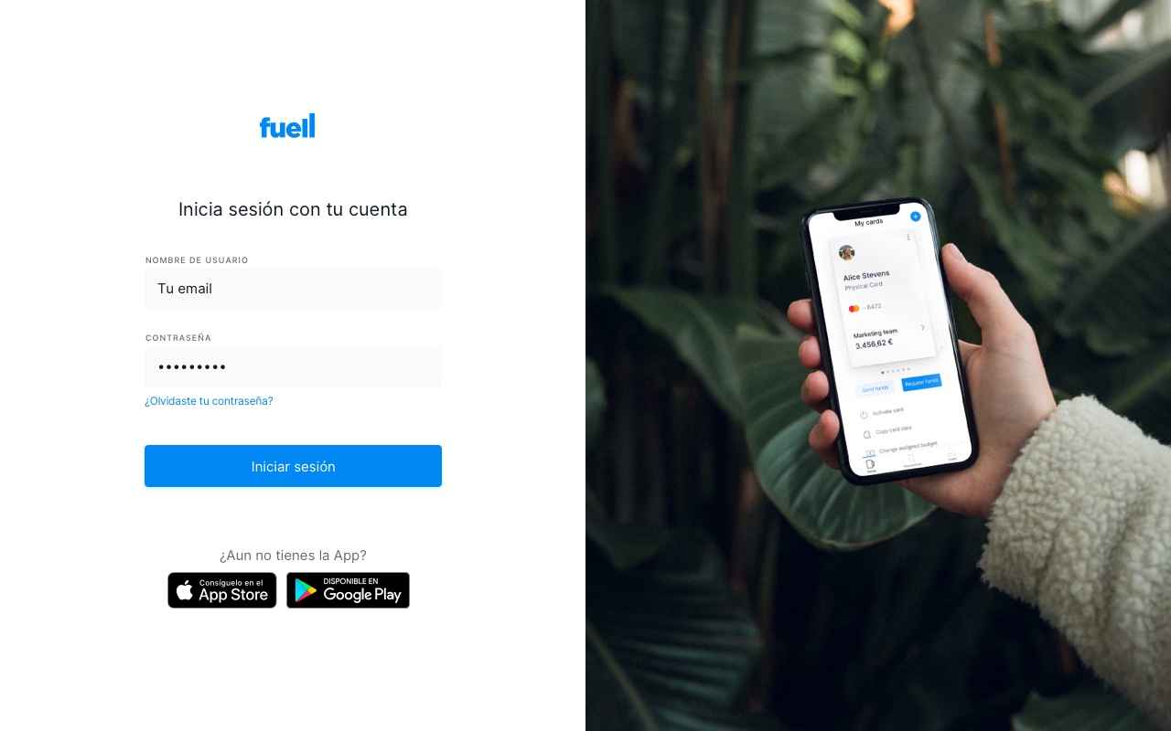
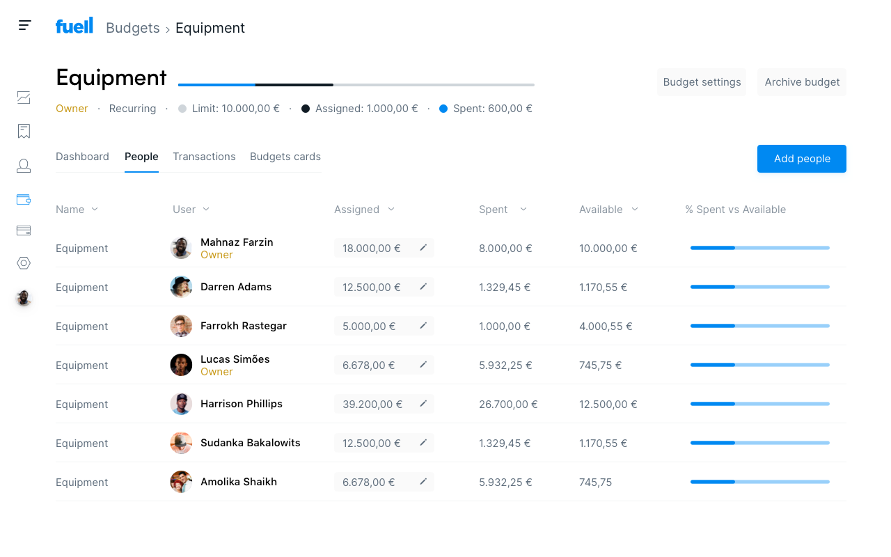
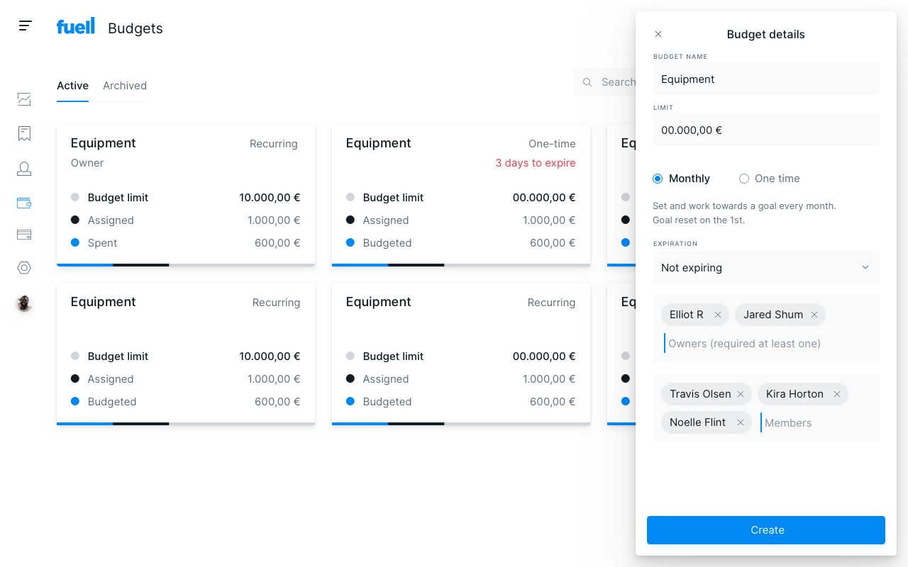
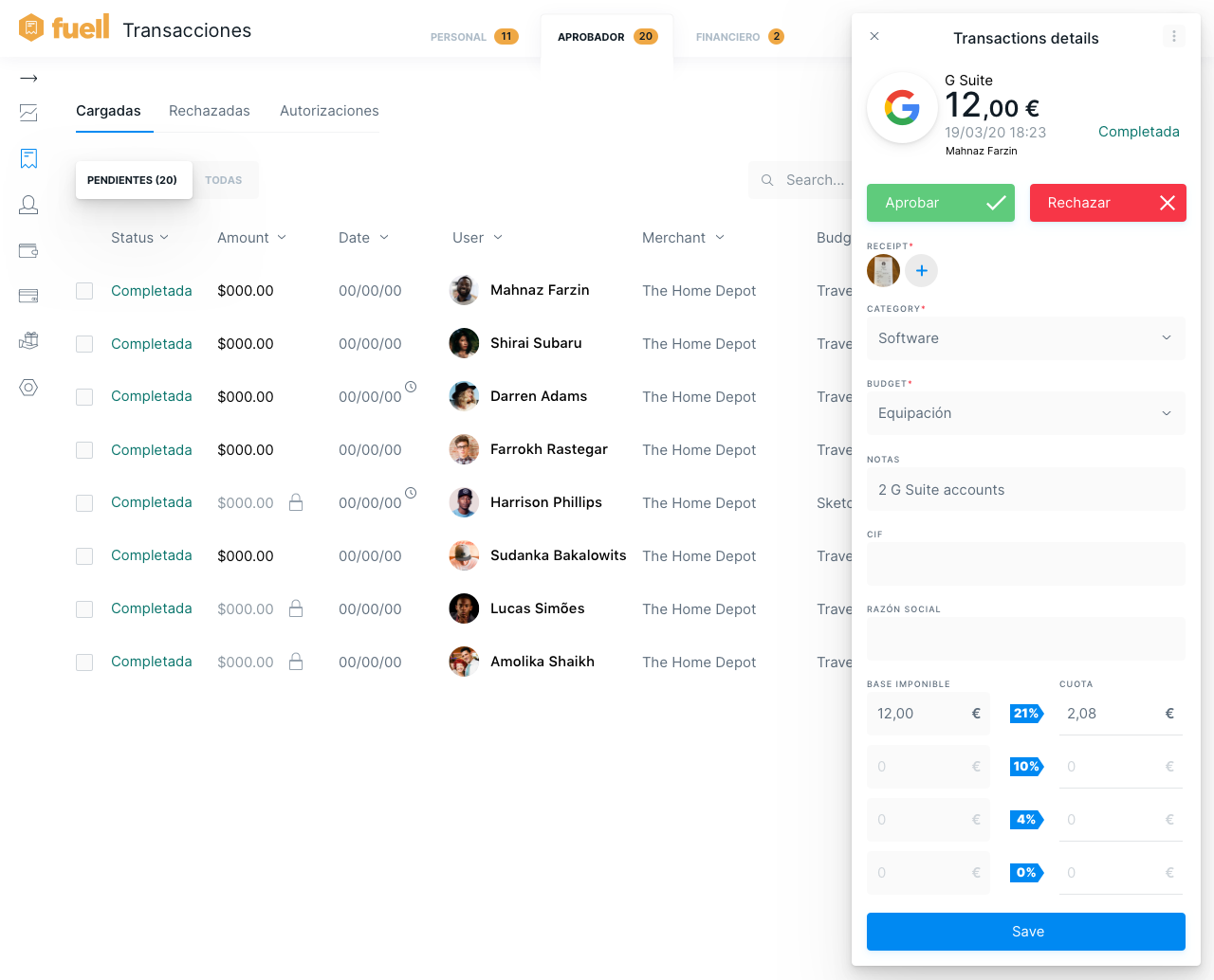

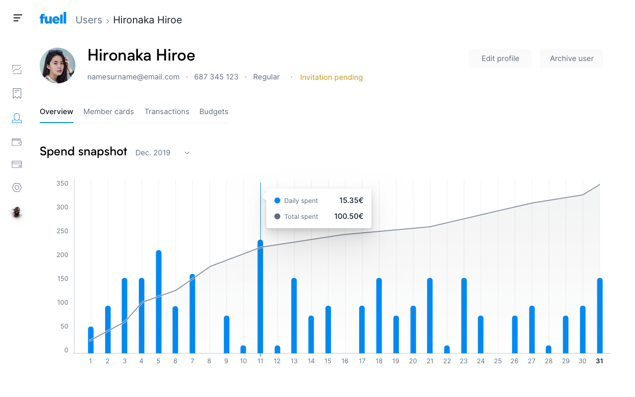
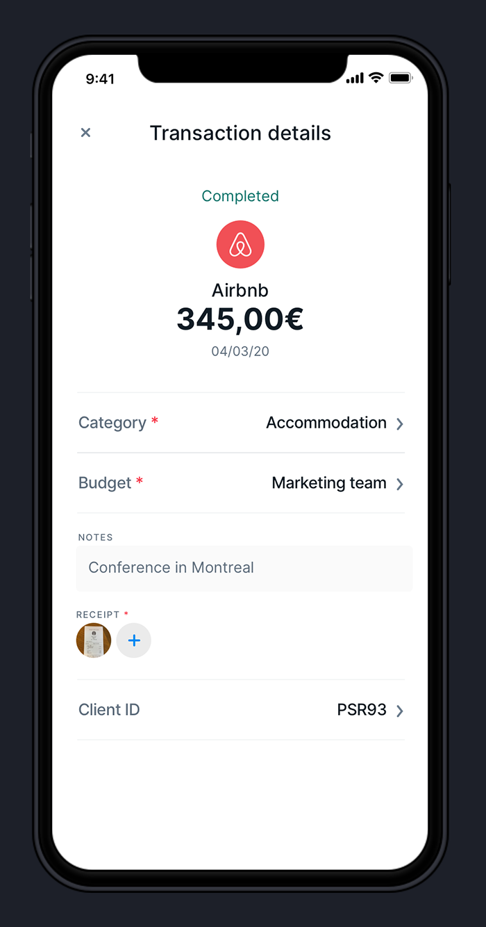
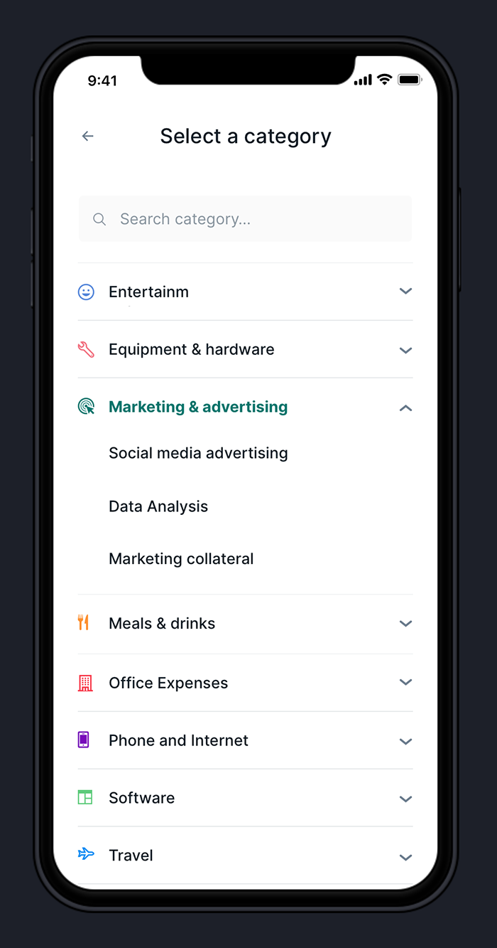
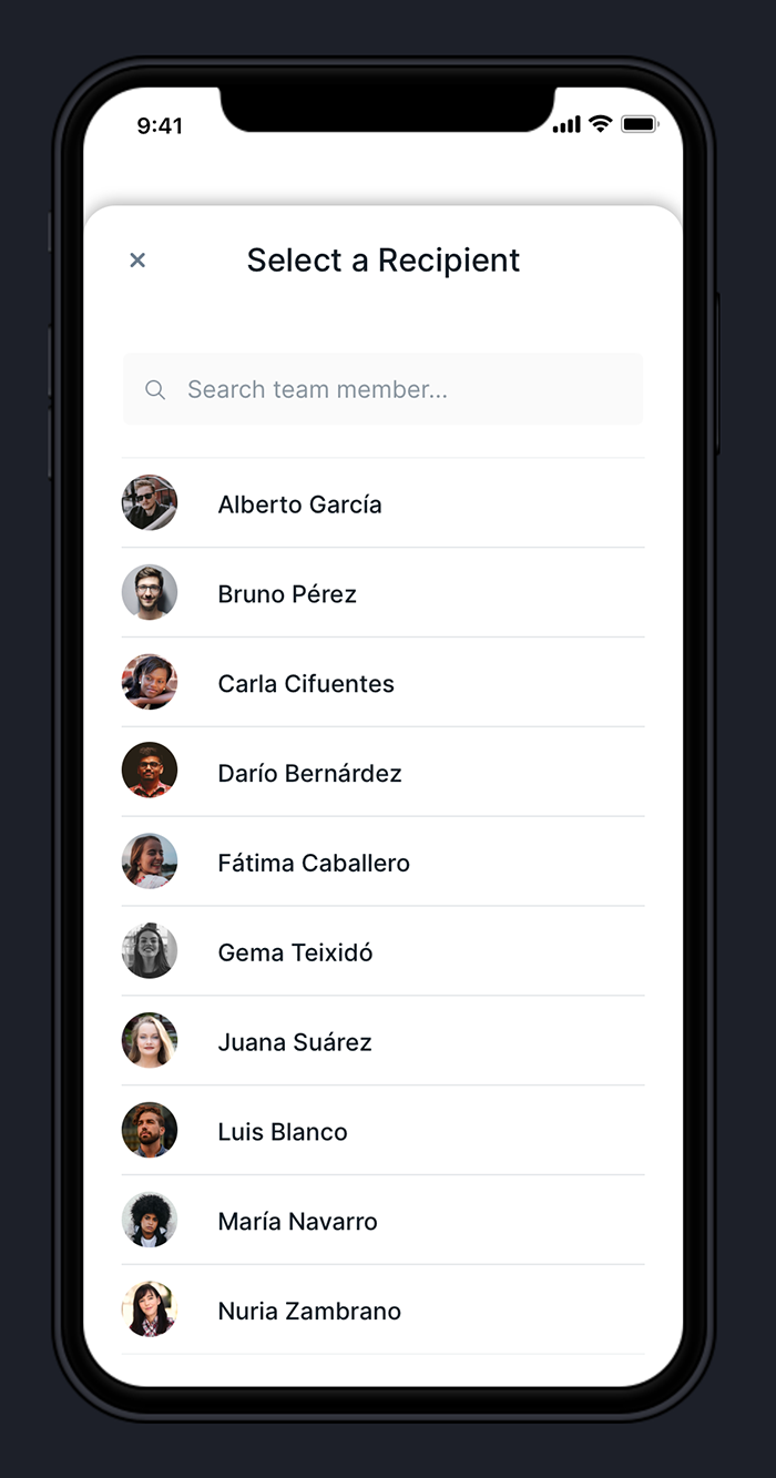
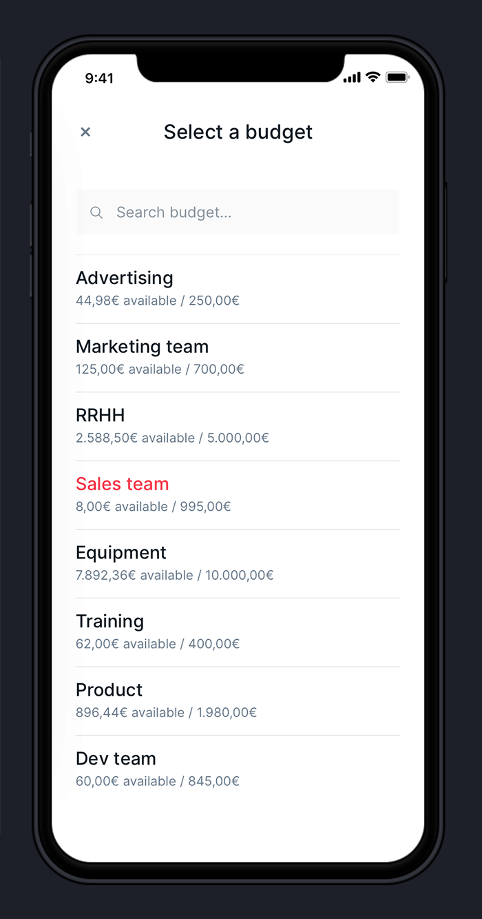
The Fuell web application is used to manage all the company’s expenses by creating and organizing budgets, teams, and employees.
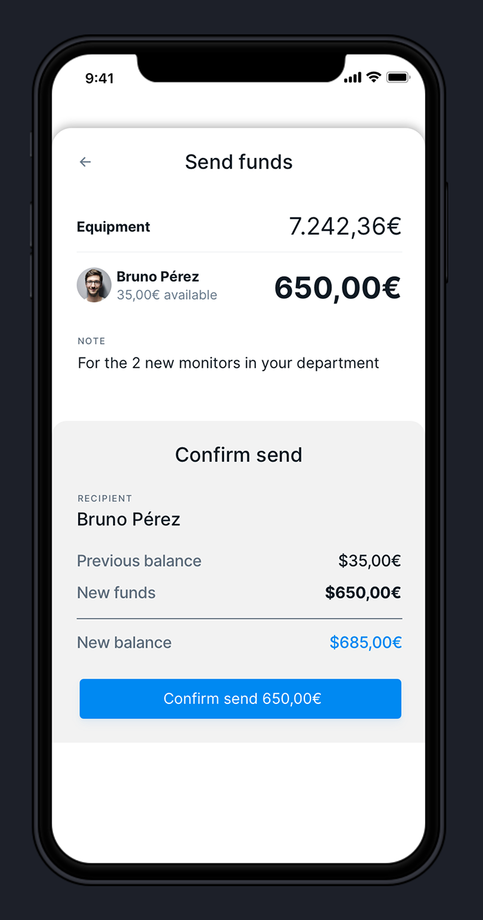
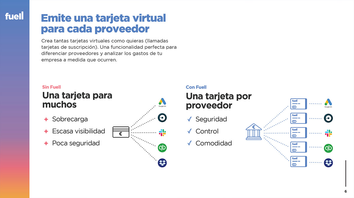
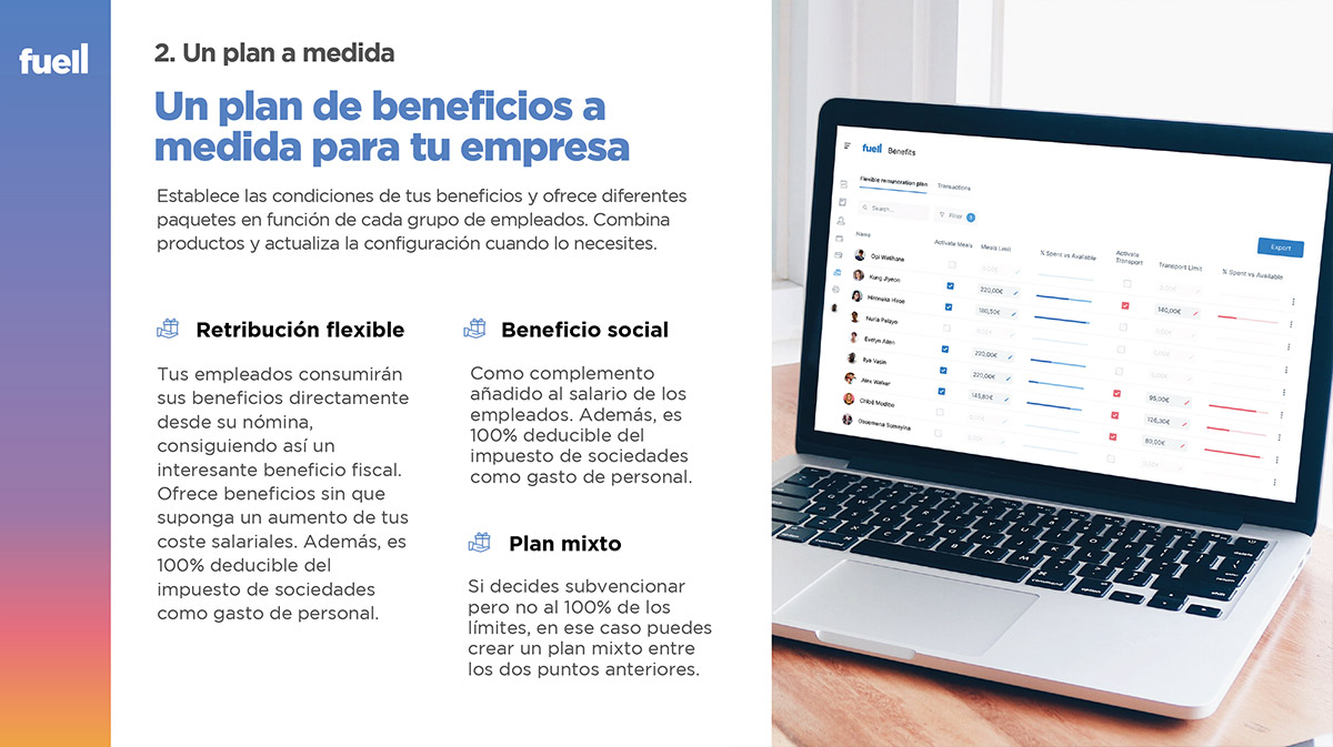
From the application, you can create a physical or virtual card for an employee or for a specific expense. For example, you can assign a monthly amount for a department of a company and distribute it in several virtual cards: one to spend on advertising on Google Adwords, another for Dropbox, and another for Spotify. A supervisor can approve each transaction and increase the budget if necessary.
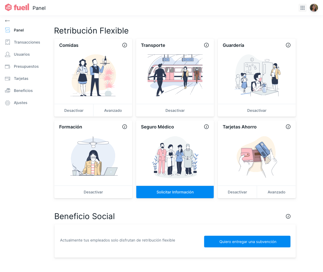
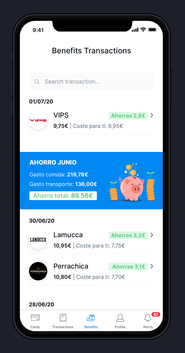
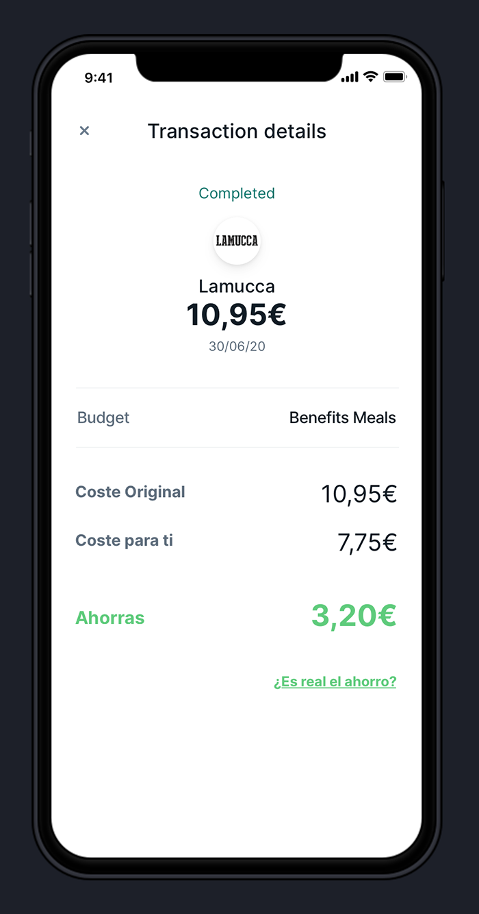
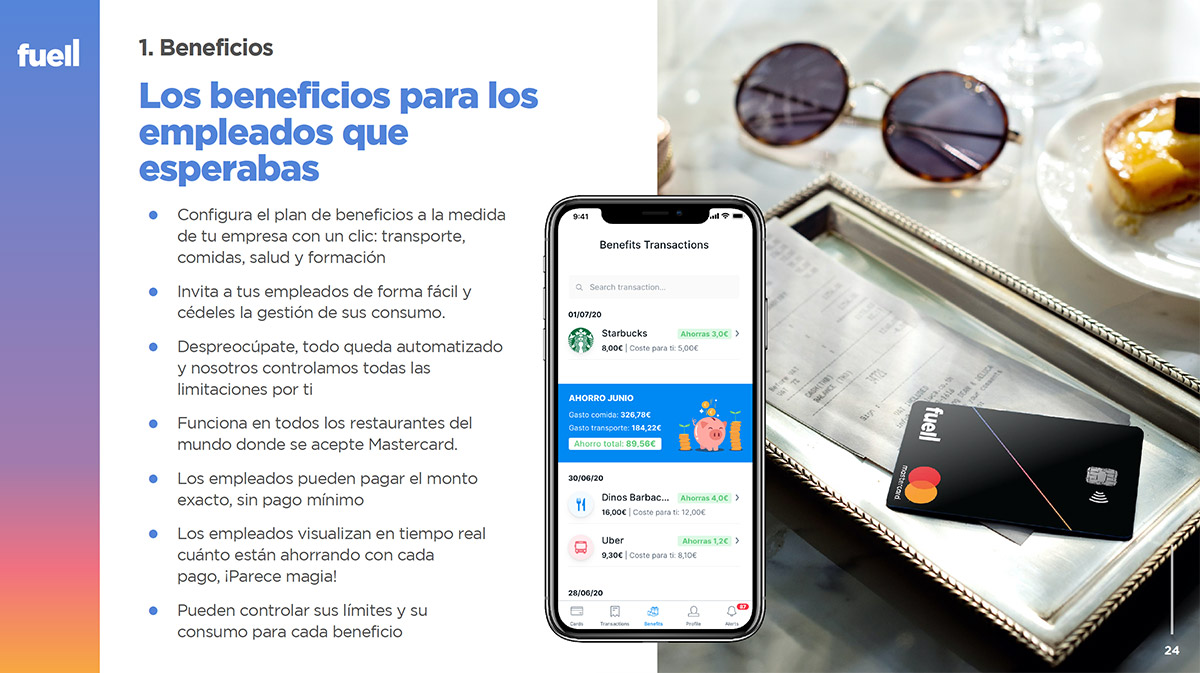
Also from the web application, the employees’ benefits are managed, so that they can save on various services using the Fuell card, for example up to 30% on the weekly lunch or 15% on public transport. There are also benefits for daycare, training, or medical insurance.
In the design of the web application, we sought to prioritize cleanliness and ease of use, eliminating all possible noise and any superfluous graphic elements.
More than 100 screens were designed and their UX was simulated in InVision to facilitate the work of the developers, who were able to review the behavior, download the assets and obtain the CSS code from the tool itself.
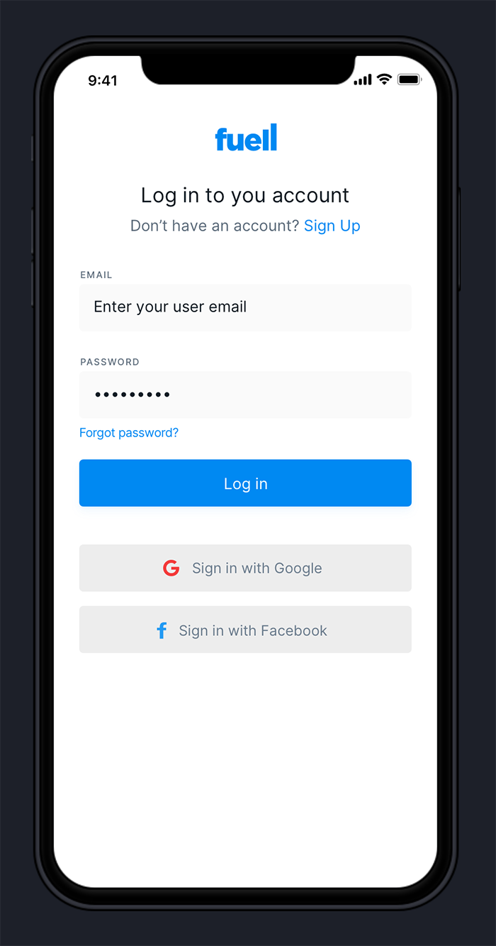
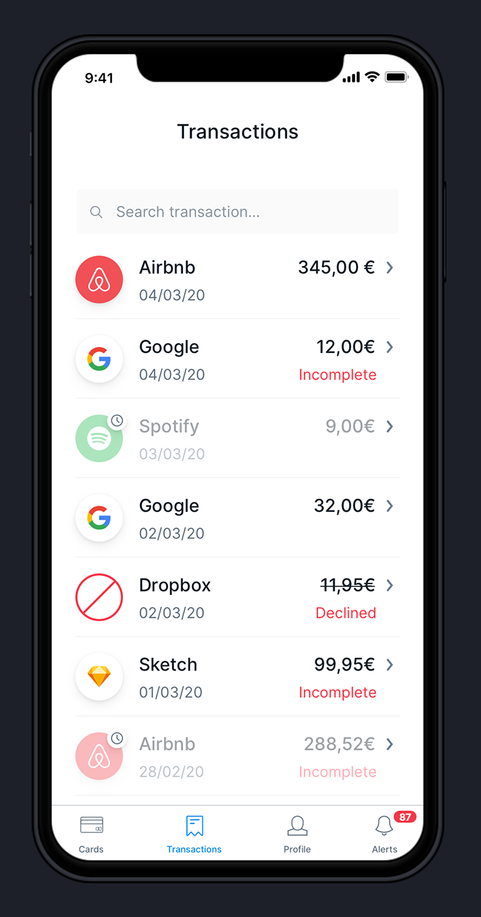
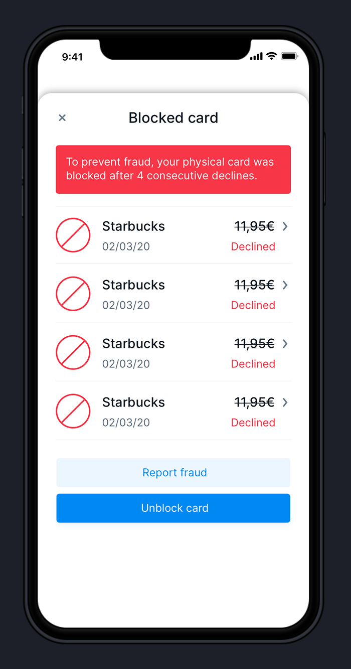
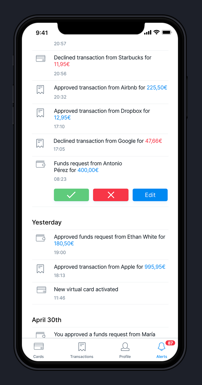
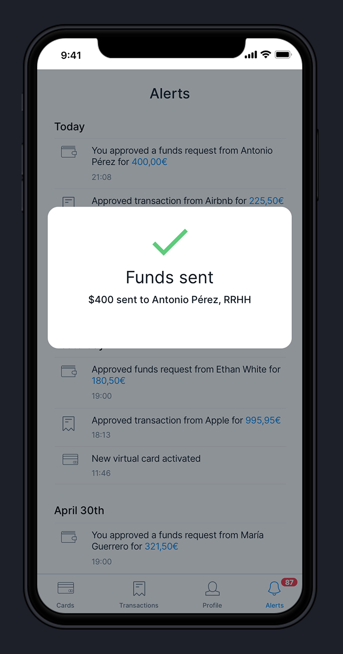
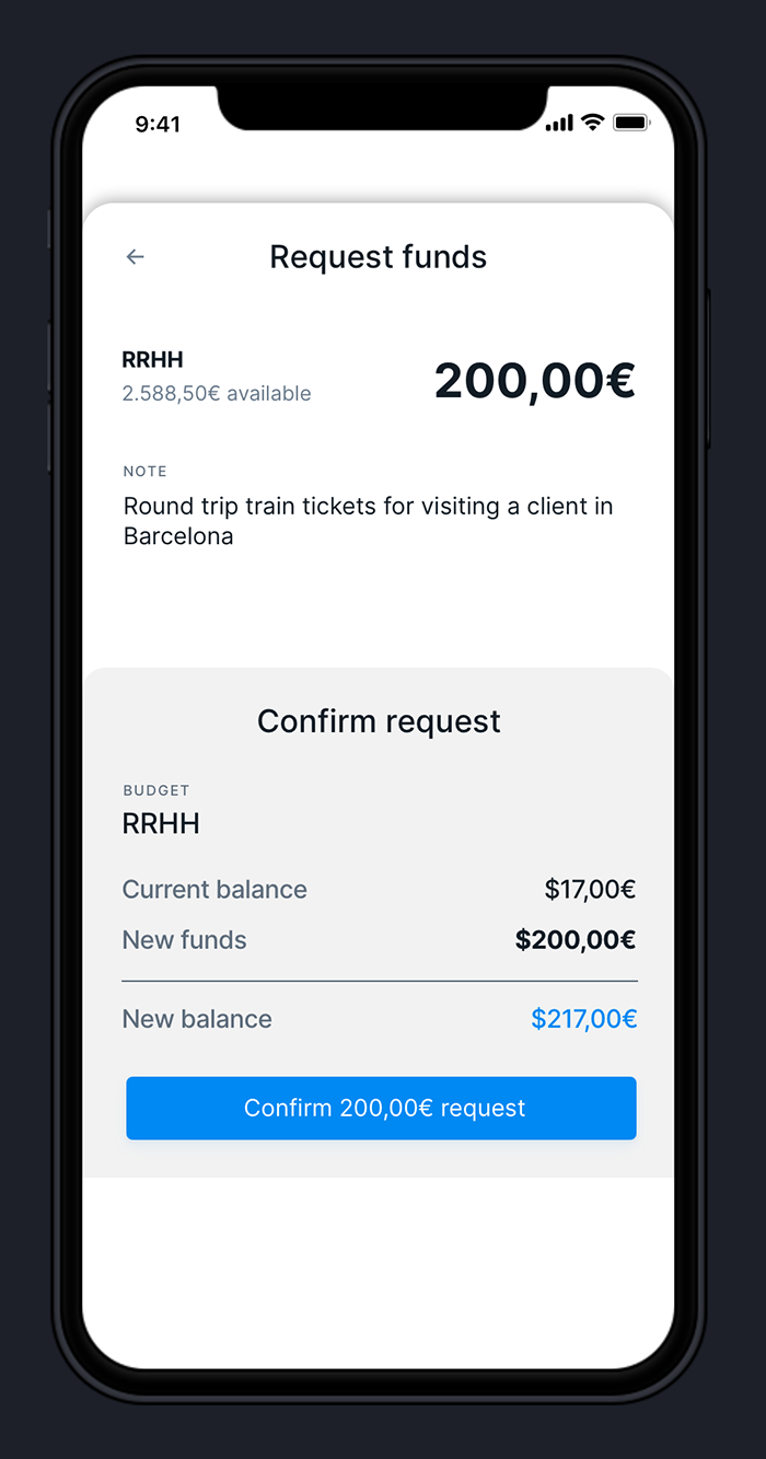
The mobile app follows the same concept as the web app, offering many features to Fuell customers through a simple and minimalist interface.
The app is available for iOS and Android, in Spanish and English.
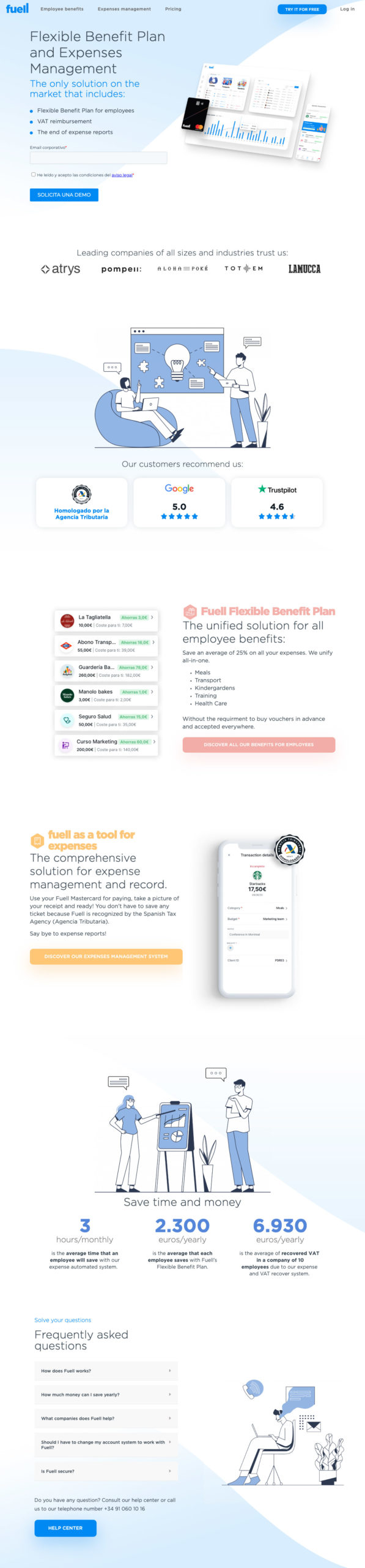
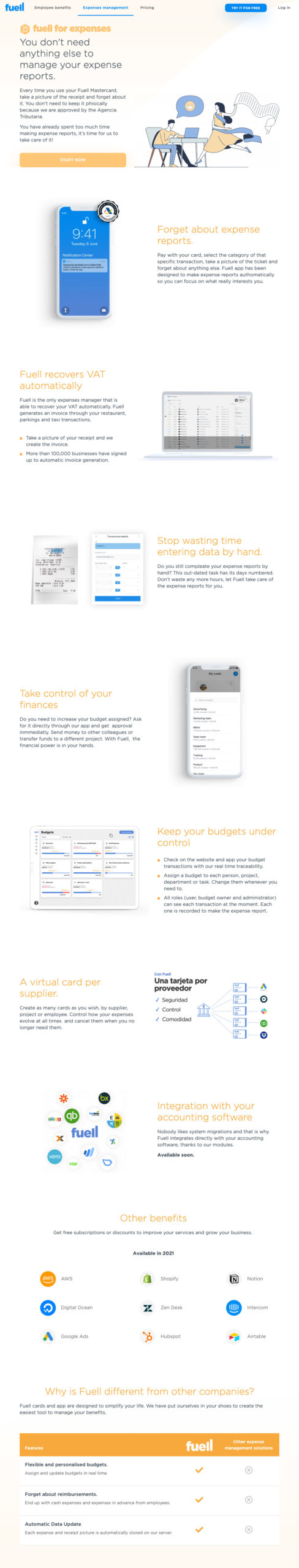
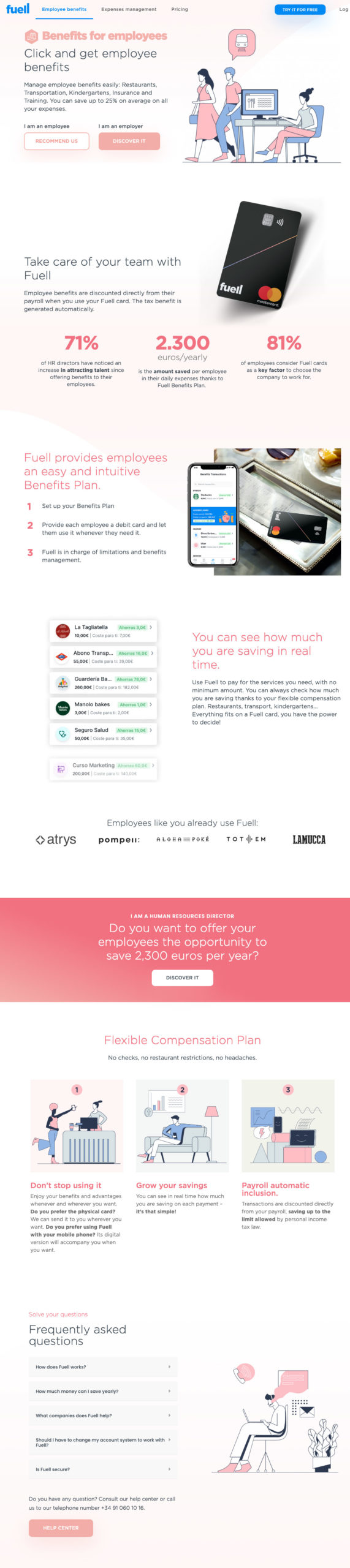
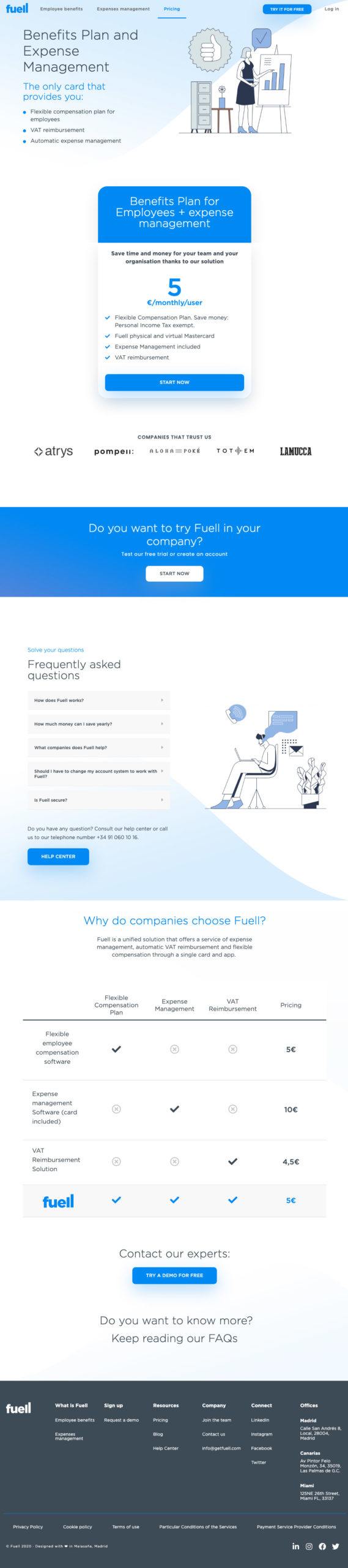
Fuell’s website highlights financial products in a simple way. I tried to convey certain tranquility mixed with professionalism, both for employees and employers, through modern and neutral illustrations using corporate colors, lots of white space, and very smooth gradients.
It is a simple, of course responsive, website that I designed and implemented directly in WordPress in English and Spanish.

Potential investors, prospect clients, employees, users, etc. there are many different presentations that a fintech startup needs.
I designed more than a dozen different presentations, in Spanish and English, to convey quality, confidence and strengthen the Fuell brand.
Although all were designed in Keynote, I must confess that I had to create Powerpoint versions for some of them and the result was very good 😀
I have done much more work for Fuell but I think you can get an idea of some of my contributions to the product.